Menu

UX Research & Design

Overview

SawStop is considering the design & development of a brand new website built on WordPress.

The project includes redesign along with thorough research, using UX and UI practices.

We follow the standard Web Content Accessibility Guidelines (WCAG) 2.1 for making web products accessible so that we can provide a proper experience to all audiences.

Contents

Phase 1: Research & Discovery

  • UX benchmarking using Baymard Institute
  • HEART Framework to Measure and Improve Your App’s UX
  • User Journey + SWOT
  • User Personas

Phase 2: Design

  • How might we…
  • Low Fidelity Wireframes
  • Usability Testing
  • UI Kit
  • High-Fidelity Design

Phase 3: Development

Phase 4: QA Testing

Phase 5: Launch & Deliver

My Role

As the Lead UX Designer for this project, I played a central role in guiding the design process from inception to delivery. I conducted extensive research to understand user needs and behaviors, collaborated closely with cross-functional teams, and ensured that the user experience was prioritized at every stage. From creating wireframes to conducting usability testing and QA, I focused on creating an intuitive and accessible website for all users.

 
In the design process we leveraged the Double-Diamond Model which features periods of ‘divergent’ and ‘convergent’ thinking.

These periods supercharge our ability to:

  1. Gain insight and define the existing problem space/future opportunities through a human-centered lens
  2. Explore and create impactful solutions that meet customer needs and business goals, then de-risk those solutions with rigorous, rapid testing

Phase 1:
Research & Discovery

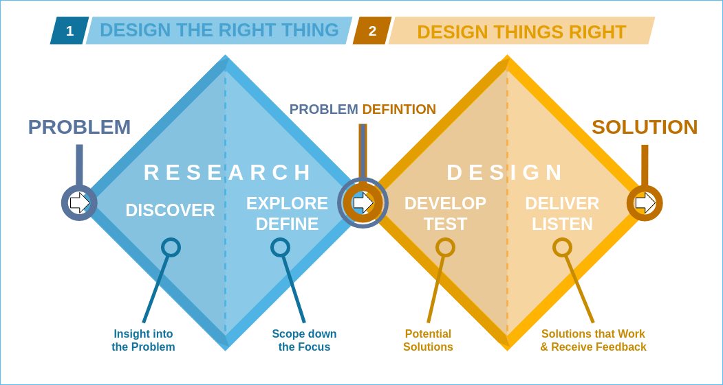
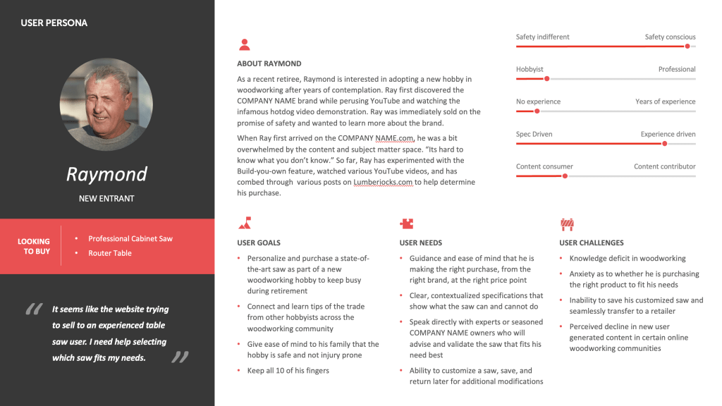
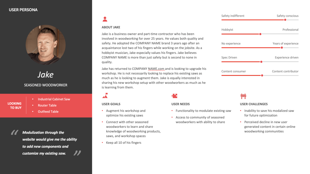
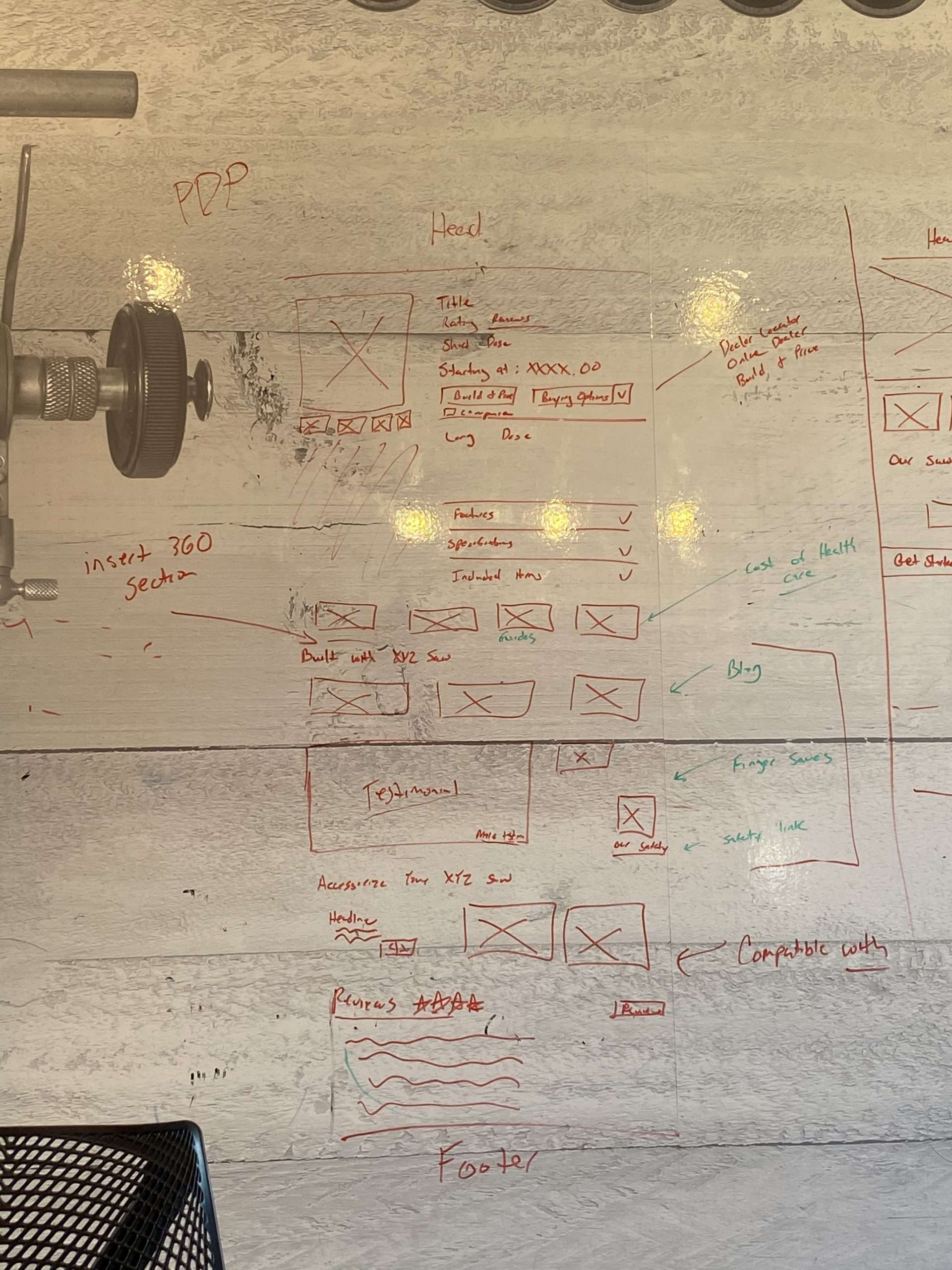
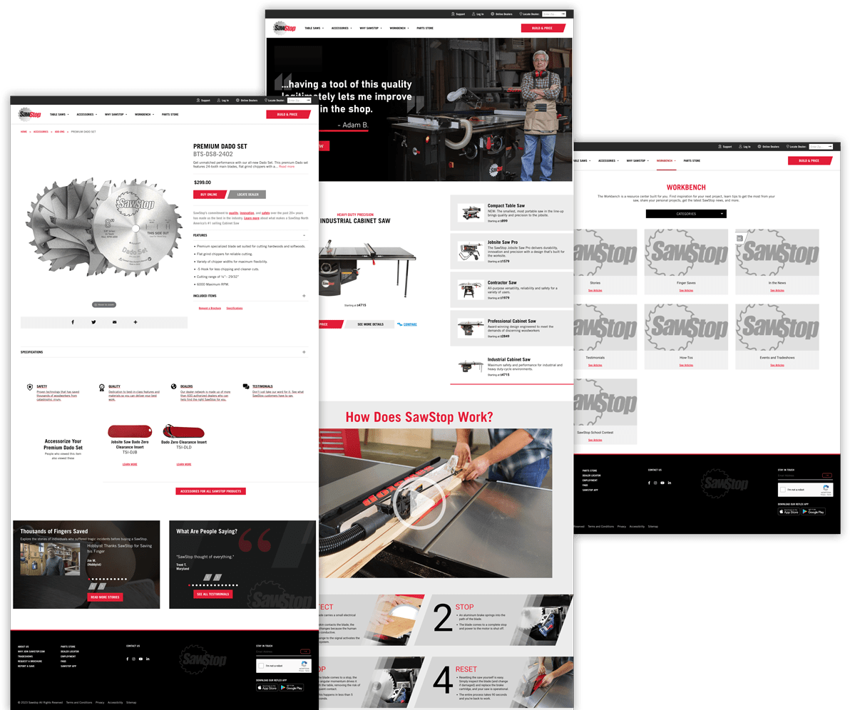
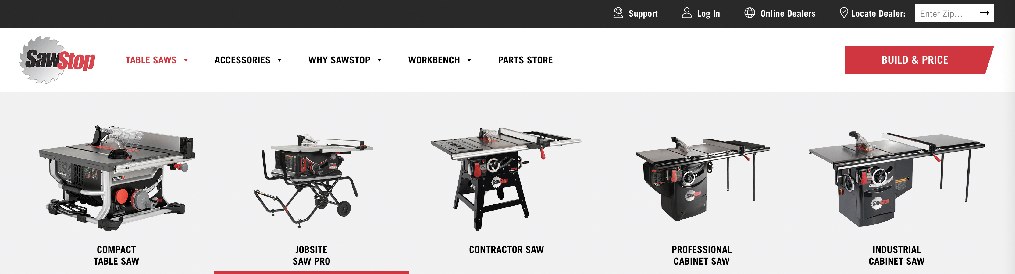
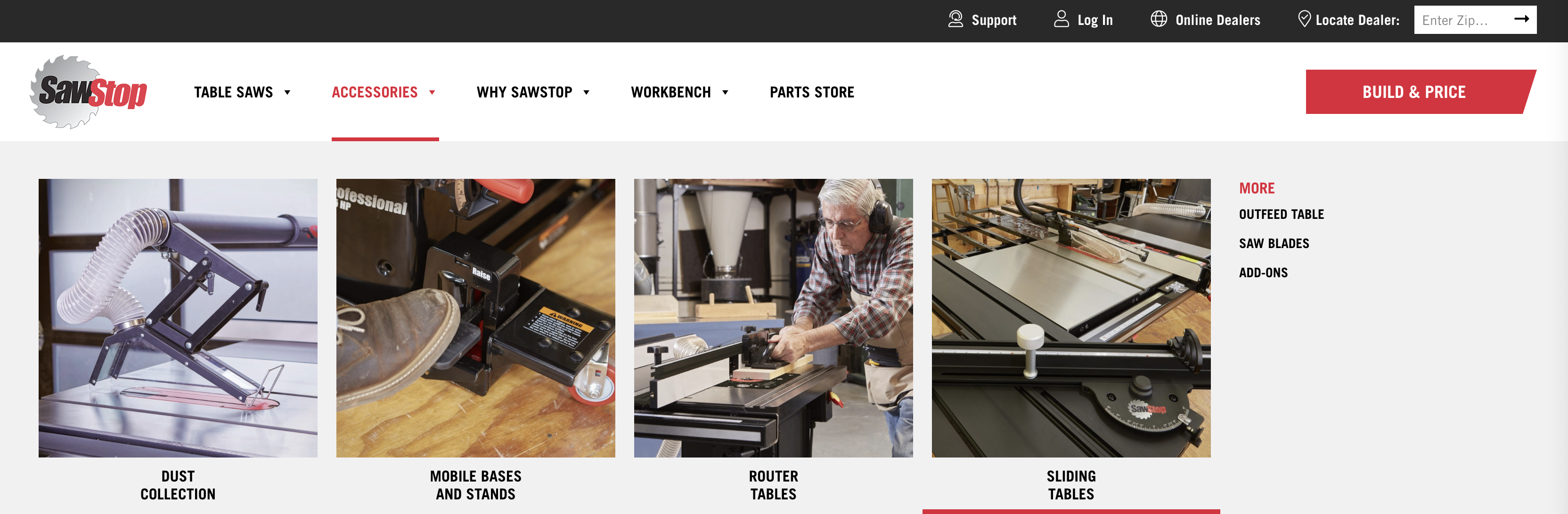
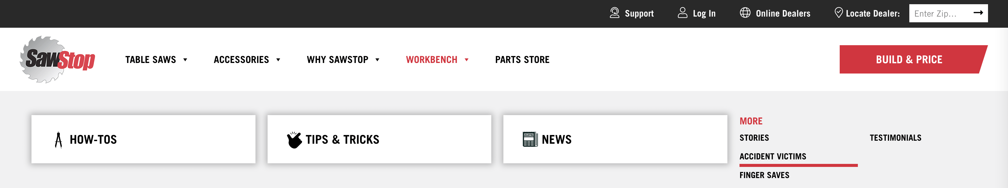
In this initial phase, our focus was on gaining a deep understanding of SawStop’s brand identity, business objectives, target audience, and user behavior. By delving into these key aspects, we set the foundation for informing the design and development of the new website. This comprehensive research phase enabled us to establish clear benchmarks and insights, guiding our recommendations to enhance the website’s functionality and responsiveness.

Existing State Analysis

We wanted to assess the product’s current state and identify areas for enhancement. Our analysis included the following components, which informed the design and development of a more effective, user-friendly product:

  1. UX benchmarking using Baymard Institute
  2. HEART Framework to Measure and Improve App’s UX
  3. User Journey + SWOT
  4. User Personas

By leveraging these analytical tools, we gained valuable insights into the existing user experience landscape, paving the way for targeted improvements in our redesign efforts.

HEART Framework

We posed high-value questions aligned with the HEART framework, focusing on Happiness, Engagement, Adoption, Retention, and Task Success. By asking these targeted questions, we aimed to measure the success of our design and assist product and development teams in making informed decisions that address both business and user needs effectively.

User Journey + SWOT Analysis

In this phase, we conducted a comprehensive analysis of the major segments that comprise the holistic user journey.

Strengths

Identified areas where SawStop excels and outlined strategies to maintain and enhance these aspects.


Weaknesses

Identified areas requiring immediate attention and devised plans to address them effectively.


Opportunities

Explored avenues for innovation to surpass customer expectations and drive growth.


Threats

Identified external hazards and developed strategies to mitigate risks effectively..

Meet our two user personas

What
We Learned

The website must cater to both new and seasoned woodworkers. The previous design did not address the needs of new entrants and primarily focused on serving established users. Our research showed that the number of new visitors to the site is equal to the number of seasoned woodworkers and existing customers, highlighting the need for equal consideration of both user groups.

Phase 2:
Design

User Experience Design is critical to the success of a brand new website. Our UX process is informed by an active and thorough research process and then results in the creation of sitemaps, journey maps, an overall understanding of information architecture, and finally wireframes.

Sitemap, User Flow & Wireframe

During collaborative whiteboarding sessions with colleagues, we crafted an MVP sitemap to outline the website's structure. We then translated these ideas into rough wireframes, facilitating a preliminary visualization of the user journey.

Subsequently, we rigorously tested and optimized the user flow using Optimal Workshop, guaranteeing a seamless and intuitive navigation experience for all users.

Screen-Shot-2023-01-03-at-5.36.46-PM

How might we...

1. Discover the brand

2. Investigate the brand

3. Commit to purchase

4. Build and customize​

5. Purchase from retailer

6. Use and experience

7. Customer support

8. On-going engagement

How might we…

Discover the brand

Raymond has been contemplating to adopt woodworking as a new hobby for the last 2 years. He first heard of the SawStop brand while speaking with various friends and acquaintances about the infamous ‘hot dog’ video. Raymond is intrigued and wants to learn more about how the technology works. Weeks have passed, and Raymond fails to remember the exact name of the brand from the mentioned video. But with Improved SEO, Raymond is able to discover SawStop.com via google search with the search terms ‘safety saw’ and ‘woodworking.’

How might we…

Investigate the brand

New comers to the site would be overwhelmed and wouldn't know what questions need to be asked.

The New Entrant Wizard makes the process of learning about the brand (and woodworking) easy. It includes an FAQ, a contextual guide to help users determine what they plan to do with the saw.

Add a series of testimonials, ratings, and reviews from other new-entrant SawStop customers

How might we…

Build and customize

Introduce Build-Your-Own

Raymond is convinced. He is ready to build, customize, and purchase his Professional Cabinet Saw. With Build-Your-Own, Raymond can select prefabbed setups according to his project and wood-material needs. He is also able to customize with cross-brand compatibility. Raymond gets real-time feedback on total-size and footprint of the saw as he adds and removes different components. When Raymond is finished, he can easily save his creation, send to an AdvisorPro for review/validation, or export/share to a printable (or mobile friendly) format for future reference.

How might we…

Purchase from retailer

Raymond has fine-tuned his model and is now ready to transfer his selection to a local retailer. Raymond is new to this and is unfamiliar with which local store will best fit his needs. He is particularly anxious that all details of his selection will be correctly processed. Build-Your-Own and AdvisorPro guarantee a warm hand-off from customer to retailer.
Raymond can now look for nearby dealers and ensure if they have a specific saw or now all from the website itself.

How might we better the…

Use and experience

Raymond receives the delivery of his brand-new saw. He is thrilled. With the highly praised manual, set-up is easy and done within just a few hours. Raymond gets delighted by receiving a courtesy call from his AdvsiorPro* who reaching out to confirm the delivery and setup went as well as expected.

How might we better the…

Customer support

It has been two weeks of Raymond using his saw. He loves it. He is able to make basic cuts and has crafted small end-table for his guest room. Raymond is looking to enhance the challenge of his new hobby by seeking inspiration for his next big project. With the Outfeed (now called WORKBENCH), Raymond can consume curated, user-generated content that provides helpful tips on new cutting techniques.

Raymond is able to read a breadth of customer content that ranges from newer entrants like himself, to more seasoned woodworkers. The Outfeed (now called WORKBENCH) leaves Raymond informed and inspired to take on the next big project.

How might we increase the…

On-going engagement

Fast-forward three years later. Raymond has relished in his woodworking hobby. He has made upgrades to his PCS with ease thanks to the ability to iterate on his saved model in Build-Your-Own. Raymond is a seasoned woodworking veteran in the making. He regularly visits the Outfeed (now called WORKBENCH) section where he has learned from and taken advice from hundreds of other customers. Raymond’s skills have improved so much that he has gone from a content consumer to a content contributor. Raymond engages regularly by sharing his own content, product set-up, and personal projects for other users to read.

Low-Fidelity Wireframes

These low-fidelity wireframes help demonstrate the functionality of the website and the user experience throughout. The skeletal format allowed for rapid iteration.

Wireframes and non-functional prototypes were created for both mobile and desktop experiences, with a focus on approximately 35 distinct page views, resulting in a total of 70 screens.

Usability Testing

Prototypes were then reviewed and tested with limited user groups to ensure that functionality is delivering on the intended experience.

UI Kit & Design

All outcomes of research, discovery, and UX design are documented into specifications for informing UI design and development activities.


Finally, a UI kit was developed to inform the system of interactions throughout the site and supplement the high-fidelity designs and prototypes.

High Fidelity Design

Once the wireframes were approved, the prototype and corresponding designs evolved to include a high-fidelity look and feel. This includes layering the SawStop brand over the wireframes and creating unique graphics to fulfill the overall vision.

Navigation

Based on our UX research, we have implemented two types of navigation menu on our website: primary navigation & courtesy navigation.

The primary navigation is designed to be the most prominent and easily accessible navigation menu on the site. By using images in addition to text labels, we aim to make the navigation intuitive and easy to use, even for those who may not be familiar with the site.

The courtesy navigation bar is located at the top of the page and is intended to provide quick access to less frequently used links. By separating the most frequently used links from the less frequently used links, we aim to make it easy for users to find what they need quickly and efficiently.

All Saws

This section is located in the second scroll of the homepage and displays all sections. We wanted to ensure that users have visual access to all sections, including the price and other details, on the homepage itself.

To ensure that all information is easily accessible, we have also included minimized descriptions on the right side, which can be viewed even without highlighting the section.

User Generated Content

Our goal is to be a one-stop-shop for all things related to woodworking, catering to both new and experienced users. To drive traffic and keep users engaged, we have introduced user-generated content, including:

  • How-Tos: In partnership with expert woodworkers, SawStop offers free plans that utilize your table saw.
  • Tips & Tricks: These resources are ideal for new woodworkers and provide helpful tips for building their projects.
  • In The News: This section displays the latest product news and media coverage.
  • Accident Victims: Stories from individuals who suffered tragic incidents before purchasing a SawStop.
  • Finger Saves: Tales from users who have saved their fingers thanks to SawStop.
  • Testimonials: Reviews and honest feedback from our customers.
  • Events and Trade shows: Keep up with upcoming events where SawStop products will be on display.
By offering this diverse range of user-generated content, we hope to create a dynamic and engaging experience for all visitors to our site.

Phase 3:
Development

Devs do their magic!


Phase 4:
QA Testing (UX Sign-off)

During this phase, I worked closely with the dev team to ensure that the UI and UX met the high standards we set for our users.


By testing every aspect of the design, we were able to catch any bugs or glitches and make any necessary adjustments before the final launch.


Phase 5:
Launch & Delivery

Finally, the moment we had been working towards had arrived! 


The feedback from our users has been overwhelmingly positive, and I’m thrilled to know that we’ve created a product that not only looks great but also delivers an exceptional user experience. 

Future State:
New Entrant Wizard

Exciting developments are currently in progress and will be available soon.


What
We Achieved

We successfully tackled a complex problem, simplifying it for our users and resulting in a product that is both aesthetically pleasing and user-friendly. Throughout our design process, we also prioritized accessibility to ensure that our website is usable by all individuals.


Our website has evolved into a thriving community where newcomers come to learn and veterans come to share their knowledge, ultimately leading to increased traffic and boosted sales of our products.


Our meticulous attention to design detail and unwavering focus on the user, including accessibility, has paid off. I am proud to have been part of such a talented and dedicated team.

Designing meaningful interactions
between people & technology