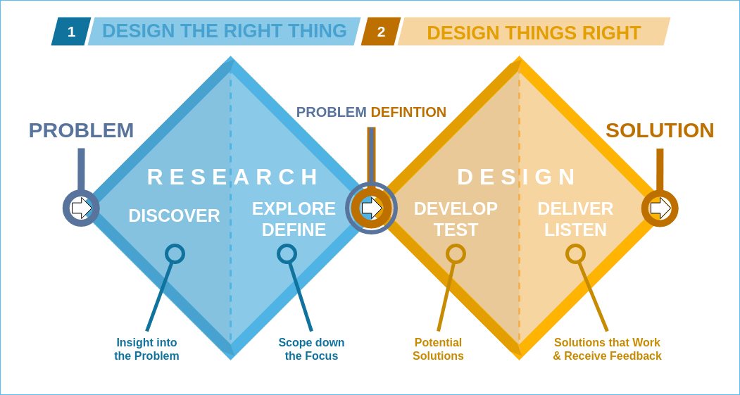
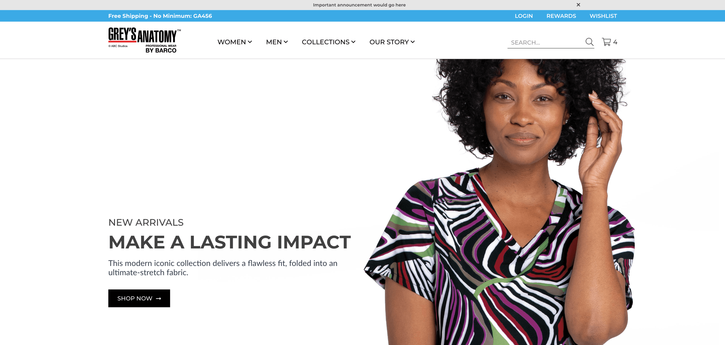
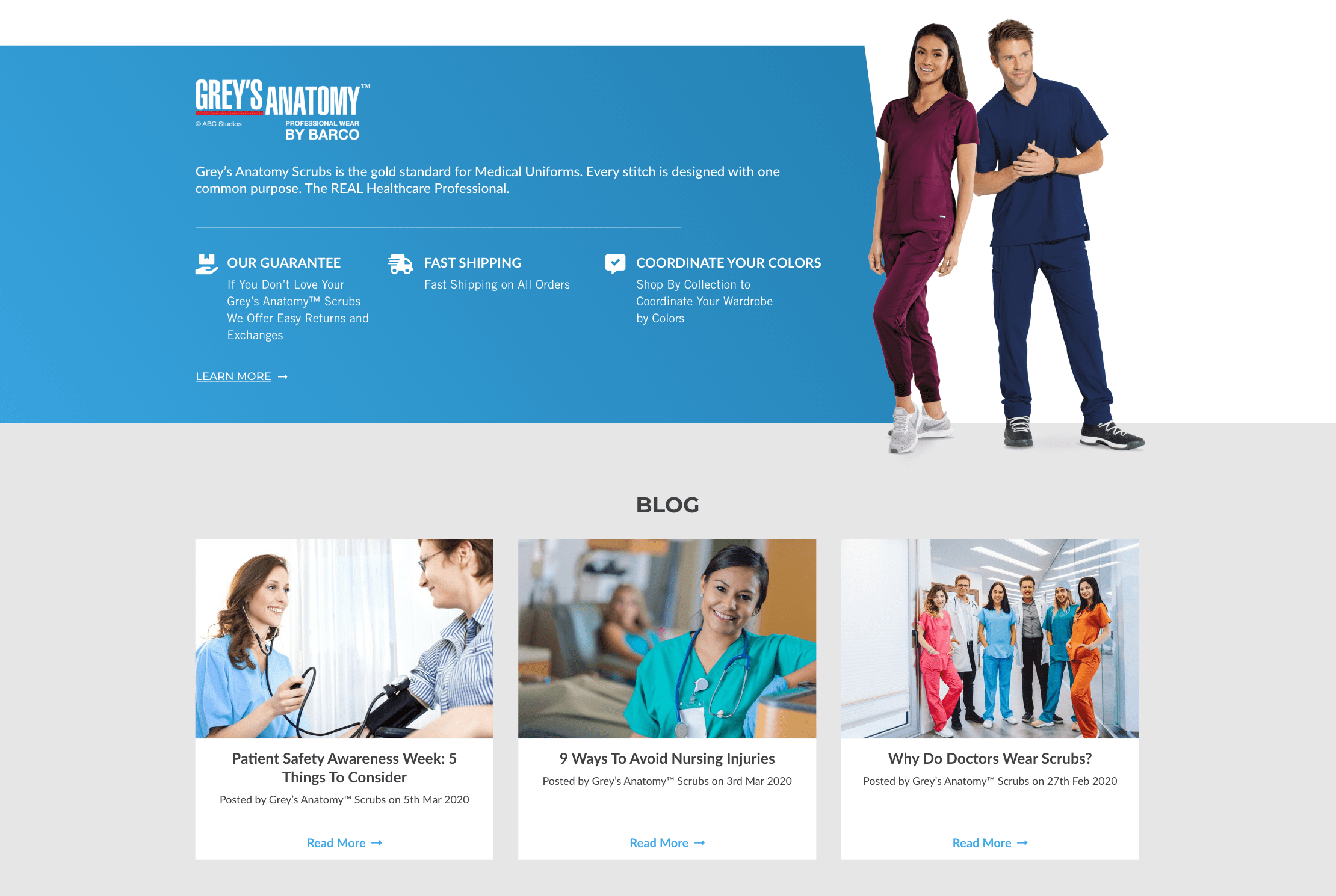
- Research & Discovery
- UX Design
- UI Design
- abc
- abc
Overview
Grey’s Anatomy™ Scrubs is currently designed and developed on BigCommerce. At this time, they are seeking a full site redesign and considering other platforms to expand their website onto. Their primary concern in the redesign process is to create a more modern and marketable website experience with attention focused on mobile buying.
Additionally, introduce new features to further engage and ultimately convert shoppers.
Toolbox
My toolbox included Adobe XD for wire-framing and creating the prototype. I used Slickplan software for creating sitemaps. I used my iPad for ideating, taking notes, and recording the meetings, and took feedback over slack.
Approach Strategy
We followed the double diamond mental model and defined our strategy.
The first version of the MVP was already built and the problem statement was defined. Our strategy was to first understand the business goals, company’s vision, and user pain points before heading into the current app design critique session.
Understanding the Business Goals & Needs
We went through various company documents, the business plan, and survey data, and also conducted the competitor analysis.
Timeline I followed
- Week 1-2: Discovery
- Week 3: Research & Preparation
- Week 4: Present Wireframes/Receive content
- Week 5-9: Present finished mockups
-
*Handed it over to the developers* -
Week 10-12: Develop WordPress/WooCommerce front-end theme - Week 13-15: Store configuration & plugin installation
- Week 16-18: Product data population & content population
-
*Staging website is shared with me for QA* -
Week 19: QA Testing and Review - Week 20: Deployment to live site
Insights
- Increase sales
- Increase product awareness
- Educate customers on the brand
- This site to be the primary go-to for Grey’s Anatomy Scrubs
- To create a more modern and marketable website experience with attention focused on mobile buying
- They want to look at the sizing chart being improved.
The app had two paths/flows, one was for women and the other for men. The experience for the men was slightly different than the women customers.
Wireframing & prototyping
We created the prototypes to clearly communicate the user interface and the site flow to the client. I wanted the design to talk about the company’s vision, unique selling proposition, and service the customers in the simplest way possible.
We created many iterations to make the app delightful and communicate the information to the users in an effective and clear way, while some interactions went ahead, some didn’t, but we learned what works and doesn’t through this process (part of the design process).
First Scroll
At a glance, we have a simple yet minimal site design. Announcement bar to show the important announcements, courtesy navigation bar is narrow yet highlighted with a blue strip to give importance to FREE SHIPPING and promo code. Important categories are in the main navigation bar along with search and cart icon.
His/ Her Section
This section is can be used to display products that the brand wants to promote. We categorized the featured section into two parts, HIS and HER, as the target audience visiting the website is equally men women, and men.
All Brands
This section displays all the collections of the brand. At a glance, it will display the collection logo. Hovering over the image will display the details about the collection.
CTA
A call to action section for offers and promotions.
Upsell
Bestsellers section introduced to encourage users to browse more products.
Trust in the Brand
A section was introduced to instill trust in the brand by displaying statistics and a few lines about the brand.
Social Feed
Displaying Instagram feed that updates the recent Instagram post.
Footer
Abc